

As lead for Highspot’s brand refresh project, I strove to create a bold modern look that focuses on human relationships that appeals to our audience of sales professionals and marketers.
Tools Used: Pen and Paper, Sketch, InVision, Photoshop, Illustrator, InDesign, Usertesting.com
Creative Direction, UI/Visual Design, User Research
The Process
Research
To kick off this project, I, alongside our User Researcher, conducted interviews with employees from all functions at Highspot to get a pulse on how the existing branding was both working and not working. We also sent surveys out to anonymous respondents to rate our brand visuals and voice in order to get a baseline score to measure the success of the new brand against. We held multiple sessions with stakeholders to determine what we wanted the new branding to convey to our audience and came up with a shortlist of brand attributes; Innovative, Trustworthy, Empowering, Intelligent, Modern, Expert, and Approachable.
One main takeaway from our research was that our website felt very impersonal and templatized; “Looks like any other SaaS tech site. More “safe” than what I’ve seen. It looks like what I’d expect out of a stock website, with a pre-made template named ‘Tech bro’.”
Mood Boards
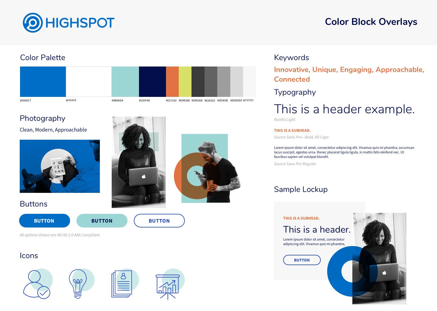
When developing mood boards, I focused on gathering imagery that fit with our desired brand attributes as well as exploring an updated color palette that felt more modern and unique but preserved our brand blue, with a slight tweak to increase the color contrast for accessibility.


Style Boards
After getting feedback from stakeholders and other members of the design team, I narrowed down my mood board directions to five. I presented these style boards along with initial website homepage designs to help illustrate how these boards would translate to a new website.


Sketching Wireframes
To prepare for presenting the style boards to stakeholders, I created a homepage design for each direction. I started by sketching wireframes of potential homepage designs, then choosing the strongest directions to mock up for the presentation.


The Solution
Final Designs
After many rounds of feedback and iteration, we designed and launched a brand new website, collateral, icon system, company templates, illustrations, social graphics, photography, and more. As project manager, creative director and lead designer for this project, I worked with three other designers to complete the work. My tasks were mostly focused on the website redesign and creation of a new brand book, as well as example collateral for the other designers to use as a visual guide.


